Aesthetics vs Functionality: The Art of Design

What Is Design?
Many people are under the perception that design is purely a creative skill, making products aesthetically pleasing. But this isn’t enough to create a proficient design. The quality of outgoing work would be higher if designers would delve into the psychology behind their projects. The user should always be at the centre point of a project. How are they going to perceive your product? How easy is it to use? Design is an act of communication, having an all-round deeper understanding of the user will result in a far more successful design. Ahead of #LEARNbyVERB UX and Conversion at Shoreditch House on the 22nd of May, Beth-May Leddra-Chapman, Digital Designer at Verb Brands, analyses how to use design for a better online functionality.
Why designing without the user in mind creates problems
The first few stages of the design process involve a lot less creativity than most people may think. Similar to how an architect works, they won’t start with wallpapers and classy armchairs, they start with how a person will be able to get from room to room or floor to floor. This is the same with digital work such as websites and applications, and it’s called wireframing.
“Design is the creation of a plan or convention for the construction of an object, system or measurable human interaction.“
“the creation of a plan” – In digital UX design, this is wireframing.
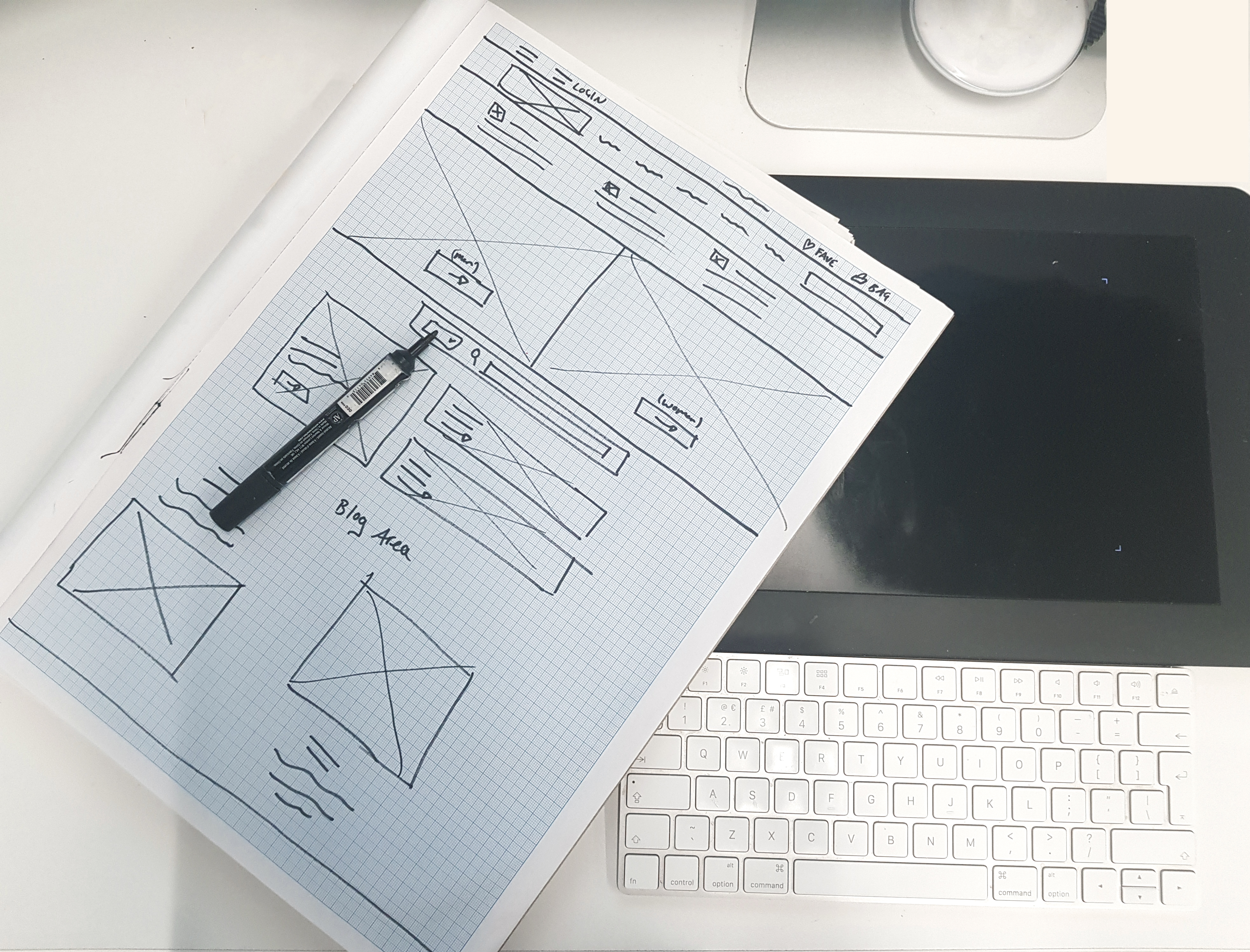
After being given a brief from a client and getting to know their goals and objectives of the project, it’s always best go back to the old school pen and paper and create quick sketches to outline the main structure of the website. This is just boxes, lines and scribbles – nothing arty. Once the main journey is planned out, it’s good to take a step back out of a designer mindset and become the user, working through how you get from page to page and considering how easy it is and where the eye lands. This helps get a better understanding of how the user will navigate through the journey, how long it takes and how many clicks are needed. Only then the design will be brought to life with colours and good-looking fonts.

If a design is done purely on how it looks, it will end up having problems such as pretty and swirly but illegible fonts, fun and bright but distracting colours, blocks of content that show no real hierarchy nor relevant information for the end user.
UX vs UI design
UX (user experience) and UI (user interface) usually come hand in hand to make a website or app beautiful and easy to use. Yet, behind the scenes, they conflict with each other throughout the process.
UI is all about how the website looks, choosing the colours and the fonts and layout of beautiful imagery. It’s the creative side of design. UX, on the other side, is all about making sure someone can easily use your website. Get from A to B as smoothly as possible, with no confusing button placements, no delayed page loads and no distracting animations.
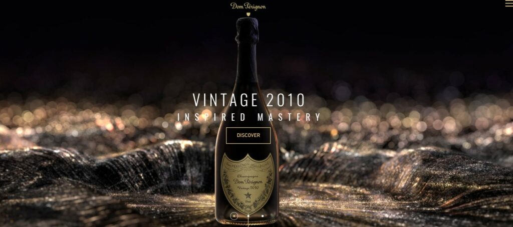
For example, when looking at Dom Perignon’s website, we can see a great example of how a website, despite looking beautiful and creative, will deter certain users. The main homepage has a large appealing header area, but it takes too long to load. You are then met with a very confusing navigation, with no real indication of where you need to go to find any information.
Overall the aim is to produce something that has both UX and UI in mind. So that something is appealing and easy to use for a user.
Summary
By making sure we take both UX and UI into consideration, we are emphasizing with the user and understanding how they will interpret something.
Following rules of UX and UI will result in the best outcome, eventually leading to better conversion, and more traffic.
The post Aesthetics vs Functionality: The Art of Design appeared first on Verb Brands.
Related News
Unlocking High-Value Insights through Analytics Excellence
The Death of the Third-Party Cookie and What it Means for Luxury Brands
How to approach Lunar New Year as a luxury brand
The power of CGI advertising in real-life marketing activations
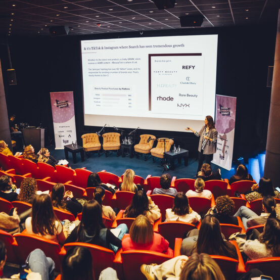
Social Media 2023, Looking Back on This Years’ Trends & Our Predictions for 2024
Unlocking the Power of Content Repurposing: A Guide to Getting More Mileage Out of Your Content
Creating a Full-Funnel Influencer Strategy for Luxury Brands